
Showing posts with label Web. Show all posts
Showing posts with label Web. Show all posts
Friday, August 7, 2009
CSS Shorthand - 1
Ok. Let’s set the record straight. There is no official guide for each and every CSS shorthand property value. So let’s work together and put one together shall we? Ok. Straight to the business. Anytime I’ve ran into a specification (besides the confusing mess at the W3C), it turns into showing off a couple of examples and you’re supposed to be set on your way. Well well. Over the years, I’ve found quite some interesting unknown quirky facts about these shorthands… hence this Guide was born.
Background
Backgrounds can be tricky. Nevertheless, effective when condensed correctly. The syntax for declaring the background shorthand values are as follows:
background properties
element {
 background-color: color || #hex || (rgb / % || 0-255);
 background-image:url(URI);
 background-repeat: repeat || repeat-x || repeat-y || no-repeat;
 background-position: X Y || (top||bottom||center) (left||right||center);
 background-attachment: scroll || fixed;
}
Believe it or not, all these properties can be combined into one single background property as follows:
the background shorthand property
element {
 background:
   #fff
   url(image.png)
   no-repeat
   20px 100px
   fixed;
}
The Unknown
Often times developers find themselves wondering What if I leave out this value or that one? How will that effect the design?
. Good questions.
By default, the background property will assume the following when you do not declare each value of the properties.
default background property values
element {
 background-color: transparent;
 background-image: none;
 background-repeat: repeat;
 background-position: top left;
 background-attachment: scroll;
}
Lesson learned: be careful on what you don’t declare. By chosing to not declare a value on a shorthand property, you are explicitly declaring the above default settings. For example, let’s look at the following example.
background shorthand example (unexplicit)
element {
 background:red url(image.png);
}
This would be the same as declaring the following values:
background shorthand example (explicit)
element {
 background:red url(image.png) repeat top left scroll;
}
Font
Font is perhaps the trickiest. However, it follows the same rules as the background shorthand property. All that you do not declare will have unexplicit values. Here is the font shorthand specification:
font properties
element {
 font-style: normal || italic || oblique;
 font-variant:normal || small-caps;
 font-weight: normal || bold || bolder || || lighter || (100-900);
 font-size: (number+unit) || (xx-small - xx-large);
 line-height: normal || (number+unit);
 font-family:name,"more names";
}
The default values for the font shorthand property are as follows:
default font property values
element {
 font-style: normal;
 font-variant:normal;
 font-weight: normal;
 font-size: inherit;
 line-height: normal;
 font-family:inherit;
}
And of course without any further ado. The font shorthand property syntax:
the font shorthand property
element {
 font:
   normal
   normal
   normal
   inhert/
   normal
   inherit;
}
Here is where it gets tricky. The fact that font-style, font-variant, and font-weight all come “normal” out of the box, you may need to pay a little more close attention when you’re styling elements that come with default browser styles like <h1> - <h6> or <strong> and <em>. For example, styling the strong element:
strong element styled with font
strong {
 font:12px verdana;
}
By writing the above into your style sheet, you will be unexplicitly removing the font-weight:bold default browser style that is applied to strong elements.
Last but not least (for -font- that is), a real world example:
font shorthand property example (unexplicit)
p {
 font:bold 1em/1.2em georgia,"times new roman",serif;
}
This would be the same as declaring the following properties:
the font shorthand property (explicit)
p {
 font-style:normal;
 font-variant:normal;
 font-weight:bold;
 font-size:1em;
 line-height:1.2em;
 font-family:georgia,"times new roman",serif;
}
Border
Let’s not waste time discussing the warnings. The same rules apply from here on out. This is all you need to know
border properties
element {
 border-width: number+unit;
 border-style: (numerous);
 border-color: color || #hex || (rgb / % || 0-255);
}
becomes this:
the border shorthand propertie
element {
 border:
   4px
   groove
   linen
}
Don’t ask me how that would look. The fact that “linen” is in there, things could get scary. Nevermind the matter, here is where ‘border’ gets funny.
border examples
p {
 border:solid blue;
}
/* will create a '3px' solid blue border...
  who knows where 3px came from?? */

p {
 border:5px solid;
}
/* will create 5px solid 'black' border...
   default must be black?? */

p {
 border:dashed;
}
/* will create a '3px' dashed 'black' border...
   3px black lines unite! */

p { border:10px red; }
p { border:10px; }
p { border:red; }
/* these just don't even work */
One thing to specially take note about declaring a border without a color, the default will be ‘black’ unless otherwise noted through an explicit or inherited ‘color’ property. See the following examples:
border color examples
p {
 border:dotted;
 color:red;
}
/* will create a 3px dotted red border */
/* ----------------------------- */
body {
 color:blue;
}
body p {
 border:5px solid;
}
/* will create a 5px solid blue border */
/* ----------------------------- */
Get it? Got it. Good! (isn’t that a song?) Anyway. On with this
Margin and Padding
These are by far the easiest. Just think about the hands of a clock starting at noon, and follow the hour. For the sake of brevity, we’ll be working with margin (since it’s a shorter word). So for all cases of margin, the same rules apply to padding.
margin properties.
element {
 margin-top: number+unit;
 margin-right: number+unit;
 margin-bottom: number+unit;
 margin-left: number+unit;
}
… combined into the margin superpowers:
the margin shorthand property
/* top right bottom left */
element {
 margin: auto auto auto auto;
}
Of course, you may declare your margin with one, two, three, or four values. Here is how each scenario will be played out:
margin fun
/* adds a 10px margin to all four sides */
element {
 margin:10px;
}

/* adds a 20px margin to top and bottom
   and a 5px margin to left and right */
element {
 margin:20px 5px;
}

/* adds a 50px margin to top
   and a 10px margin to left and right
   and a 300px margin to bottom */
element {
 margin:50px 10px 300px;
}
Understood? Let’s keep going. This is fun isn’t it! (whatever, you like it).
Outline
Quite frankly, this property has dropped off the existence of the design radar. Mainly because of lack of browsers supporting this CSS 2.1 standard (yep, it’s an actual property), but nonetheless, it too has a shorthand property. This property follows the exact same (or same exact - they mean the same thing) specification as the ‘border’ shorthand property. But, for purposes of this being a Guide, it must be here. So:
outline properties
element {
 outline-width: number+unit;
 outline-style: (numerous);
 outline-color: color || #hex || (rgb / % || 0-255);
}
Outline written as shorthand:
outline shorthand property
element {
 outline:3px dotted gray;
}
For purposes of trying to keep things from repeating, please see the border shorthand section on this document to understand the odds, ends, and quirks of the outline property.
List-style
This is it. The last one. It’s rarely used frequently. Hence rarely. That is why I kept it until the end (sorry, the best was first in my own opinion). Here is the list-style properties:
list-style properties
element {
 list-style-type: (numerous);
 list-style-position:inside || outside;
 list-style-image:url(image.png);
}
Here is the defaults:
list-style property defaults
element {
 list-style-type:disc;
 list-style-position:outside;
 list-style-image:none;
}
And for the sake of final brevity. Here is a simple example:
list-style shorthand property example
ul li {
 list-style:square inside url(image.png);
}
/* in this particular case if image.png is not available
   then a square will be provided as secondary */
That’s it!
I hope this provides years and years of referencing for all your CSS shorthand needs. When CSS3 is finally outside its working draft, expect to see this guide updated as necessary.
CSS: Block Box, Line Box and Inline Box
Block-Level Elements
The short definition is that block-level elements are elements that create blocks or large groupings of text.
block-level elements have some specific distinctions from inline elements:
* block-level elements generally can contain text, data, inline elements, or other block-level elements.
* block-level elements generally begin new lines of text.
* block-level elements inherit directionality information differently from inline elements.
Examples:
* <p></p>
* <blockquote></blockquote>
* <table></table>
Inline Elements
The short definition is that inline elements are elements that are found in the text of the HTML document. They are also sometimes called text level elements.
Inline elements have some specific distinctions from block-level elements:
* Inline elements generally only contain text, data or other inline elements. They are usually "smaller" than block-level elements.
* Inline elements do not generally begin new lines of text.
* Inline elements inherit directionality information differently from block-level elements.
Also Known As: text level elements
Examples:
* <span></span>
* <strong></strong>
* <abbr></abbr>
There are block-level boxes, line boxes and inline-level boxes. A block-level box is like a paragraph. A line box is like a line of text. And inline-level boxes are like words inside a line.
The precise rules are below and in other modules, but in summary, a block-level box contains either other block-level boxes (e.g., a section containing paragraphs, or a table containing rows), or it contains line boxes (e.g., a paragraph containing lines of text). A line box contains inline-level boxes (e.g., a line with words in different styles). An inline-level box may contain either text interspersed with more inline-level boxes, or it may contain a block-level box (e.g., a small table that is rendered inline).
For example, a fragment of HTML such as
<ul>
<li>The first item in the list.
<li>The second item.
</ul>
may result in one block-level box for the ul element, containing two block-level boxes for the two li elements, each of which has one line box (i.e., one line of text). Both line boxes contain two inline-level boxes: one that contains the list bullet and one that contains the text.
Note how the li is transformed into multiple boxes, including one that contains generated content, viz., the list bullet, which is not present in the source document.
If the document is rendered in a narrow window, it may be that the li elements get transformed into even more boxes, because the text requires multiple lines. And if the document is rendered on paper, it may be that a page break falls in the middle of the ul element, so that it is not transformed into a single block-level box, but into two smaller ones, each on a different page.
CSS: Box Model
Box dimensions
Each box has a content area (e.g., text, an image, etc.) and optional surrounding padding, border, and margin areas; the size of each area is specified by properties defined below. The following diagram shows how these areas relate and the terminology used to refer to pieces of margin, border, and padding:

The margin, border, and padding can be broken down into top, right, bottom, and left segments (e.g., in the diagram, "LM" for left margin, "RP" for right padding, "TB" for top border, etc.).
The perimeter of each of the four areas (content, padding, border, and margin) is called an "edge", so each box has four edges:
- content edge or inner edge
- The content edge surrounds the rectangle given by the width and height of the box, which often depend on the element's rendered content. The four content edges define the box's content box.
- padding edge
- The padding edge surrounds the box padding. If the padding has 0 width, the padding edge is the same as the content edge. The four padding edges define the box's padding box.
- border edge
- The border edge surrounds the box's border. If the border has 0 width, the border edge is the same as the padding edge. The four border edges define the box's border box.
- margin edge or outer edge
- The margin edge surrounds the box margin. If the margin has 0 width, the margin edge is the same as the border edge. The four margin edges define the box's margin box.
Each edge may be broken down into a top, right, bottom, and left edge.
The dimensions of the content area of a box — the content width and content height — depend on several factors: whether the element generating the box has the 'width' or 'height' property set, whether the box contains text or other boxes, whether the box is a table, etc. Box widths and heights are discussed in the chapter on visual formatting model details.
The background style of the content, padding, and border areas of a box is specified by the 'background' property of the generating element. Margin backgrounds are always transparent.
8.2 Example of margins, padding, and borders
This example illustrates how margins, padding, and borders interact. The example HTML document:
<!DOCTYPE HTML PUBLIC "-//W3C//DTD HTML 4.01//EN">
<HTML>
<HEAD>
<TITLE>Examples of margins, padding, and borders</TITLE>
<STYLE type="text/css">
UL {
background: yellow;
margin: 12px 12px 12px 12px;
padding: 3px 3px 3px 3px;
/* No borders set */
}
LI {
color: white; /* text color is white */
background: blue; /* Content, padding will be blue */
margin: 12px 12px 12px 12px;
padding: 12px 0px 12px 12px; /* Note 0px padding right */
list-style: none /* no glyphs before a list item */
/* No borders set */
}
LI.withborder {
border-style: dashed;
border-width: medium; /* sets border width on all sides */
border-color: lime;
}
</STYLE>
</HEAD>
<BODY>
<UL>
<LI>First element of list
<LI class="withborder">Second element of list is
a bit longer to illustrate wrapping.
</UL>
</BODY>
</HTML>
results in a document tree with (among other relationships) a UL element that has two LI children.
The first of the following diagrams illustrates what this example would produce. The second illustrates the relationship between the margins, padding, and borders of the UL elements and those of its children LI elements. (Image is not to scale.)
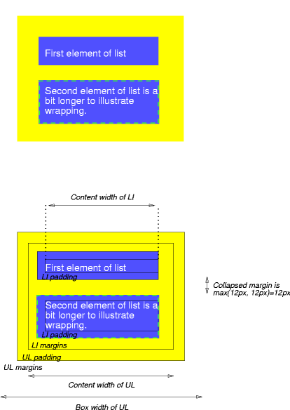
Note that:
- The content width for each LI box is calculated top-down; the containing block for each LI box is established by the UL element.
- The margin box height of each LI box depends on its content height, plus top and bottom padding, borders, and margins. Note that vertical margins between the LI boxes collapse.
- The right padding of the LI boxes has been set to zero width (the 'padding' property). The effect is apparent in the second illustration.
- The margins of the LI boxes are transparent — margins are always transparent — so the background color (yellow) of the UL padding and content areas shines through them.
- The second LI element specifies a dashed border (the 'border-style' property).
CSS: Float Layouts
Everything Does Not Float
"Panta rhei," said
Herakleitos, everything is floating. Even if the
underlying philosophy, that everything is constantly changing, very much applies
to the web, it doesn't apply to today's topic. To make an element float we have
to say so explicitly, for instance like this: float:left
When we make an element floating, we ask the browser to shift it
sideways, either to the left or to the right, as far as it will go.
Those who really understand the previous sentence already know half of what
you need to know to use floats. There are three important pieces of information
in that sentence, so let us examine them before we tackle the other, somewhat
trickier, half.
Step Aside Please
The first thing we need to remember is that a floating element is shifted
either to the left or to the right. It is not possible to make an element float
in the centre, something that often is frustrating for beginners. If you think
about it awhile, it's fairly clear why it is so. Why? To answer that we have to
jump ahead of ourselves a bit and see what happens when we create a floating
element in our document.
A common usage for floats is with images. We want to insert an image and make
the text flow around it. With CSS we don't make the text floating,
but the image. If the image has float:left the text will flow on
its right side. If the image has float:right the text will flow on
its left side.
If it were possible to make an image float in the centre, the browser would
have to make the text flow on two sides of it. Contrary to the two
simpler cases, it's far from clear how that would be done. Should the text lines
split in two to make room for the image? Or should the text suddenly split into
two columns? Unless the image is very small, it is also likely that the
available space on either side of the image won't be enough for long words.
The second important piece of information in the basic rule above is that a
floating element is only shifted sideways. We have seen optimistic attempts to
specify float:top in order to move something to the top of the
page.
In order to really understand float theory you have to understand what a
line box means in CSS. Unfortunately, that in turn
requires you to understand what is meant by an inline box, which is
way too complicated to explain in any detail here. If you're interested (and
slightly masochistic) you can try to decipher the explanation in
section 9.2.2 of the CSS 2.1 specification.
An inline box is generated by those elements that aren't block-level, such as
EM. Furthermore, an anonymous inline box is generated by
text nodes inside block-level elements. It's not too hard to imagine that each
block-level element consists of a rectangular box. An inline box can also be
viewed as such a box, although it obeys slightly different laws than its cousin
the block box.
A line box is an imaginary rectangle that contains all the inline boxes that
make up a line in the containing block-level element. It is (at least) as tall
as its tallest line box.
We won't dig deeper into the box theory than this, so we'll entertain the
notion that a line box is an imaginary box that encompasses an entire line of
text and (non-floating) images. The reason for this digression is that we need
to know that the upper edge of a floating box is aligned with the upper edge of
the current line box (or with the bottom edge of the previous block box, if
there is no line box).
It is also good to know that all floating elements automatically become block
boxes. Thus it's not necessary so say display:block for a floating
element. More about that later.
Okay, so what does this mean in plain English? It means that a floating box
can never end up above the upper edge of the line where it's created. Or, in
other words, that a floating element is only shifted sideways, but we knew
that.
The Buck Stops Here
The third important detail in the basic rule above is the words "as far as
it will go". When we float an element it is shifted to the right or to the
left until it reaches the edge of the containing block. If we then float another
element nearby in the same direction, it will be shifted until its edge reaches
the edge of the first floating element. In other words, it will settle beside
the first element. If we float more elements in the same direction they will
stack up, but sooner or later we'll run out of space. We'll look at what happens
then in a moment, but we need another dose of theory first.
What Is Really Happening?
Just like absolutely positioned elements, floats are removed from the
document flow. They don't affect subsequent block-level elements. However, the
line boxes that are generated next to a float are shortened. Think of it as if
they're just making room, horizontally.
Let's say that we have a number of text paragraphs. In the first paragraph we
want to insert a tall, but narrow, image, and we want the text to flow on the
right side of the image. So we set float:left on the image.
The line boxes that are generated by the text in the first paragraph are
shortened so that they start at the right edge of the image and stretch to the
right edge of the paragraph box. But the image is so tall that the text of the
first paragraph ends before it reaches the bottom edge of the image.
The next paragraph, a block-level element, isn't affected by the floating
image. It has been removed from the document flow. Its block box is created at
the usual distance from the first paragraph's block box, with consideration to
margins and all that. Here's the beauty of it: the second paragraph's line boxes
are also shortened, just as in the first paragraph.
And so it goes on until the text lines reach the bottom edge of the image.
Then the line boxes no longer need to be shortened, and the text continues below
the image.
One, Two, Three, Many
Let's look back to the example where we let a number of elements float in the
same direction. For each floating element, our line boxes are shortened, and
eventually there isn't enough space for the next float.
We now see the next important trait of floats: when there is insufficient
space on the line, they are shifted downward until they fit. This can be
extremely valuable in layouts that need to work in different window sizes. If
the columns are floating, they are rendered side by side in a wide window, or
stacked vertically in a narrow one.
Er … Mate, It's Hanging Out
As we just saw, a floating element can extend past the bottom edge of the
block-level element where it was created. A block box is not extended to enclose
its floating children, since that would make it impossible to achieve the smooth
effect we desired in the example above with the tall, narrow image. (A floating
element is extended to enclose its floating children, though.)
Sometimes this is the desired effect, sometimes it's not. Fortunately,
there's a way to cancel it. We can force an element to drop below all floating
elements via the clear property. If we specify
clear:left the element drops below all elements floating on its
left side. With clear:both we can make sure that an element drops
below all floating elements that would otherwise affect it.
For a block box the shift is accomplished by incrementing its top margin
until the upper edge of the element is below the lower edge of all floating
elements created earlier in the document. (Don't be embarrassed if you have to
read the previous sentence several times to understand it, this is tricky
stuff.)
For inline boxes it's even more complicated, but the result is the same.
And floating elements can set the clear property, too…
Why do we need to know all this? Because it has consequences that would
otherwise seem quite inexplicable. Let's say that we want to make sure that an
H2 heading doesn't end up next to a float. So we set
clear:both on it. Let's also assume that we want a certain margin
between any float and the heading, so we set margin-top:1em. It is
now very possible that we get into a situation where the heading butts up
against the float. Why?
Remember that floats don't affect subsequent block boxes. If we hadn't set
the clear property of the heading, it would have been created
1em below the previous block-level element (and the heading would
have ended up next to a left-floating element extending past its containing
block). Since we do set the clear property, the top margin is
increased until the upper edge of the heading is below the bottom edge of the
floating element. But no more!
If we want to ensure some space around a floating element, we have to set the
margins on the floating element itself.
Floating Columns
How can we use floats to create a multi-column layout, and why is this
sometimes better than absolute positioning?
If we enclose each column in a DIV element with
float:left they will appear side by side, just as we expect columns
to do. If we then want a full-width footer to be shown at the bottom, no matter
which column happens to be longest, we only need to set clear:both
on it.
In a floating layout we want to specify the column widths in percents. Here's
some good advice: don't specify the percentages so that they add up to 100%
exactly (e.g. 60/40 or 25/50/25). The slightest rounding error will then cause
the right-most column to drop below the others. Instead, use 60/39 or 25/49/25,
to be on the safe side.
A fully liquid layout has some inherent problems. In modern browsers (read:
anything but IE) we can set a min-width (preferably in
ems) for each column. In a narrow window, one or more columns may
drop below the others, which may not be all that pleasing aesthetically, but
it's often more user-friendly than having to scroll horizontally.
So we solve the footer problem with liquid columns, something that just
cannot be done with absolute positioning. We do, however, have another problem
that is easier to solve with absolute positioning: source order. It is often
desirable to have the main content of the page as early as possible in the
markup. Less relevant things like navigation and ads can come later. But with
floats we are constrained to specifying them in the proper order. If we want a
menu on the left, ads on the right, and the content in the middle, the content
can't come first. Or can it…?
It's possible, but it's not trivial. Let's say that we want the content
first, then the left menu and the ads last. Let's also say that we want to use
the proportions 25/50/25. Furthermore, we want a border between the columns. In
order to achieve this we need to add a couple of extra DIV elements
to group things. The structure will be as follows:
The outer container consists of an inner container (on the left) and the ad
sidebar (on the right). The CSS looks like this:
#outer {
margin:0 25%;
border:1px solid #000;
border-width:0 1px;
}
The left and right margins are set to 25% to make room for the side columns,
and then we add a thin black border on either side.
The inner container consists of the content column (on the right) and the
menu (on the left). The CSS:
#inner {
float:left;
width:99%;
}
#content {
float:right;
width:99%;
}
#menu {
float:left;
width:50%;
margin-left:-49.9%;
}
The inner container itself is thus floating to the left and occupies almost
all of the outer container's width – except for the margins, of course.
The content column is floating within the floating inner container, occupying
most of its width.
The menu floats to the left, so that it ends up next to the floating content
column. Its width is supposed to match the outer container's left margin, which
is set to 25%. But if we specify the menu width as a percentage, it means a
percentage of the inner container's width, not of the page width. The inner
container's width is (almost) half the window width (99% of 100% minus two
margins of 25%), so the menu's width is approximately 25% divided by .5, which
equals 50%. Phew!
As if this weren't enough, the menu also has a negative left margin
that is almost as large as its width. The operative word here is
almost. The negative margin causes the menu, which only has 1% of the
inner container's width to live in, to be shifted outside the inner container
and end up in the outer container's left margin, which we created for that
specific purpose.
So why don't we set the left margin to -50%? Because we can't
move the menu completely out of the inner container. If we do, it won't
"exist" in the inner container anymore, and if the menu column happens to
be the longest, it will overwrite a subsequent footer. Since this technique
causes the menu to actually overlap the inner container a little, we should give
any child elements of the menu a right margin to create some space.
The CSS for the sidebar column is similar to the one for the
menu:
#sidebar {
float:right;
width:50%;
margin-right:-49.9%;
}
The sidebar is after the inner container in the markup. The inner container
is left-floating and occupies 99% of the centre. Since we float the sidebar to
the right and give it a negative right margin, we shift it out into the margin
just like we did with the menu. The width is computed in the same way and as
with the menu we should give any child elements some left margin to prevent
them from overlapping the border.
If we try this now, it won't work at all. Why? Since all components are
floating and thereby removed from the document flow, the outer and inner
containers have no content at all. The remedy for this is to add a couple of
equalising elements that make sure the containers actually contain their
floating children:
The CSS for those elements look as follows:
.cleared {
clear:both;
line-height:0;
}
There shouldn't be any doubt about what clear:both means by now,
but what does line-height have to do with anything? We don't want
these equalisers to take up any space, but if we specify them as empty elements
they will be excluded in some browsers. Therefore we let them contain a
and then we set the line height to zero.
Bugs, Bugs And More Bugs
If you've endured this far you probably realise by now that floating elements
aren't exactly trivial. It should come as no surprise that even browsers have
some problems with them. At least some browsers. We talk, of course, about
Internet Explorer for Windows.
IE/Win has so many
complicated float-related bugs that we can't go into it here. The example in
this article doesn't work at all in IE/Win, but the article is too
long anyway, without venturing into the jungle of bug fixing.
Fortunately, there is a simple solution that fixes many of the
IE float bugs. We saw earlier that all floats become a block box.
The standard says that the display property is to be ignored for
floats, unless it's specified as none. If we set
display:inline for a floating element, some of the
IE/Win bugs disappears as if by magic. No one knows exactly why.
IE/Win doesn't make the element into an inline box, but many of the
bugs are fixed.
"Panta rhei," said
Herakleitos, everything is floating. Even if the
underlying philosophy, that everything is constantly changing, very much applies
to the web, it doesn't apply to today's topic. To make an element float we have
to say so explicitly, for instance like this: float:left
When we make an element floating, we ask the browser to shift it
sideways, either to the left or to the right, as far as it will go.
Those who really understand the previous sentence already know half of what
you need to know to use floats. There are three important pieces of information
in that sentence, so let us examine them before we tackle the other, somewhat
trickier, half.
Step Aside Please
The first thing we need to remember is that a floating element is shifted
either to the left or to the right. It is not possible to make an element float
in the centre, something that often is frustrating for beginners. If you think
about it awhile, it's fairly clear why it is so. Why? To answer that we have to
jump ahead of ourselves a bit and see what happens when we create a floating
element in our document.
A common usage for floats is with images. We want to insert an image and make
the text flow around it. With CSS we don't make the text floating,
but the image. If the image has float:left the text will flow on
its right side. If the image has float:right the text will flow on
its left side.
If it were possible to make an image float in the centre, the browser would
have to make the text flow on two sides of it. Contrary to the two
simpler cases, it's far from clear how that would be done. Should the text lines
split in two to make room for the image? Or should the text suddenly split into
two columns? Unless the image is very small, it is also likely that the
available space on either side of the image won't be enough for long words.
The second important piece of information in the basic rule above is that a
floating element is only shifted sideways. We have seen optimistic attempts to
specify float:top in order to move something to the top of the
page.
In order to really understand float theory you have to understand what a
line box means in CSS. Unfortunately, that in turn
requires you to understand what is meant by an inline box, which is
way too complicated to explain in any detail here. If you're interested (and
slightly masochistic) you can try to decipher the explanation in
section 9.2.2 of the CSS 2.1 specification.
An inline box is generated by those elements that aren't block-level, such as
EM. Furthermore, an anonymous inline box is generated by
text nodes inside block-level elements. It's not too hard to imagine that each
block-level element consists of a rectangular box. An inline box can also be
viewed as such a box, although it obeys slightly different laws than its cousin
the block box.
A line box is an imaginary rectangle that contains all the inline boxes that
make up a line in the containing block-level element. It is (at least) as tall
as its tallest line box.
We won't dig deeper into the box theory than this, so we'll entertain the
notion that a line box is an imaginary box that encompasses an entire line of
text and (non-floating) images. The reason for this digression is that we need
to know that the upper edge of a floating box is aligned with the upper edge of
the current line box (or with the bottom edge of the previous block box, if
there is no line box).
It is also good to know that all floating elements automatically become block
boxes. Thus it's not necessary so say display:block for a floating
element. More about that later.
Okay, so what does this mean in plain English? It means that a floating box
can never end up above the upper edge of the line where it's created. Or, in
other words, that a floating element is only shifted sideways, but we knew
that.
The Buck Stops Here
The third important detail in the basic rule above is the words "as far as
it will go". When we float an element it is shifted to the right or to the
left until it reaches the edge of the containing block. If we then float another
element nearby in the same direction, it will be shifted until its edge reaches
the edge of the first floating element. In other words, it will settle beside
the first element. If we float more elements in the same direction they will
stack up, but sooner or later we'll run out of space. We'll look at what happens
then in a moment, but we need another dose of theory first.
What Is Really Happening?
Just like absolutely positioned elements, floats are removed from the
document flow. They don't affect subsequent block-level elements. However, the
line boxes that are generated next to a float are shortened. Think of it as if
they're just making room, horizontally.
Let's say that we have a number of text paragraphs. In the first paragraph we
want to insert a tall, but narrow, image, and we want the text to flow on the
right side of the image. So we set float:left on the image.
The line boxes that are generated by the text in the first paragraph are
shortened so that they start at the right edge of the image and stretch to the
right edge of the paragraph box. But the image is so tall that the text of the
first paragraph ends before it reaches the bottom edge of the image.
The next paragraph, a block-level element, isn't affected by the floating
image. It has been removed from the document flow. Its block box is created at
the usual distance from the first paragraph's block box, with consideration to
margins and all that. Here's the beauty of it: the second paragraph's line boxes
are also shortened, just as in the first paragraph.
And so it goes on until the text lines reach the bottom edge of the image.
Then the line boxes no longer need to be shortened, and the text continues below
the image.
One, Two, Three, Many
Let's look back to the example where we let a number of elements float in the
same direction. For each floating element, our line boxes are shortened, and
eventually there isn't enough space for the next float.
We now see the next important trait of floats: when there is insufficient
space on the line, they are shifted downward until they fit. This can be
extremely valuable in layouts that need to work in different window sizes. If
the columns are floating, they are rendered side by side in a wide window, or
stacked vertically in a narrow one.
Er … Mate, It's Hanging Out
As we just saw, a floating element can extend past the bottom edge of the
block-level element where it was created. A block box is not extended to enclose
its floating children, since that would make it impossible to achieve the smooth
effect we desired in the example above with the tall, narrow image. (A floating
element is extended to enclose its floating children, though.)
Sometimes this is the desired effect, sometimes it's not. Fortunately,
there's a way to cancel it. We can force an element to drop below all floating
elements via the clear property. If we specify
clear:left the element drops below all elements floating on its
left side. With clear:both we can make sure that an element drops
below all floating elements that would otherwise affect it.
For a block box the shift is accomplished by incrementing its top margin
until the upper edge of the element is below the lower edge of all floating
elements created earlier in the document. (Don't be embarrassed if you have to
read the previous sentence several times to understand it, this is tricky
stuff.)
For inline boxes it's even more complicated, but the result is the same.
And floating elements can set the clear property, too…
Why do we need to know all this? Because it has consequences that would
otherwise seem quite inexplicable. Let's say that we want to make sure that an
H2 heading doesn't end up next to a float. So we set
clear:both on it. Let's also assume that we want a certain margin
between any float and the heading, so we set margin-top:1em. It is
now very possible that we get into a situation where the heading butts up
against the float. Why?
Remember that floats don't affect subsequent block boxes. If we hadn't set
the clear property of the heading, it would have been created
1em below the previous block-level element (and the heading would
have ended up next to a left-floating element extending past its containing
block). Since we do set the clear property, the top margin is
increased until the upper edge of the heading is below the bottom edge of the
floating element. But no more!
If we want to ensure some space around a floating element, we have to set the
margins on the floating element itself.
Floating Columns
How can we use floats to create a multi-column layout, and why is this
sometimes better than absolute positioning?
If we enclose each column in a DIV element with
float:left they will appear side by side, just as we expect columns
to do. If we then want a full-width footer to be shown at the bottom, no matter
which column happens to be longest, we only need to set clear:both
on it.
In a floating layout we want to specify the column widths in percents. Here's
some good advice: don't specify the percentages so that they add up to 100%
exactly (e.g. 60/40 or 25/50/25). The slightest rounding error will then cause
the right-most column to drop below the others. Instead, use 60/39 or 25/49/25,
to be on the safe side.
A fully liquid layout has some inherent problems. In modern browsers (read:
anything but IE) we can set a min-width (preferably in
ems) for each column. In a narrow window, one or more columns may
drop below the others, which may not be all that pleasing aesthetically, but
it's often more user-friendly than having to scroll horizontally.
So we solve the footer problem with liquid columns, something that just
cannot be done with absolute positioning. We do, however, have another problem
that is easier to solve with absolute positioning: source order. It is often
desirable to have the main content of the page as early as possible in the
markup. Less relevant things like navigation and ads can come later. But with
floats we are constrained to specifying them in the proper order. If we want a
menu on the left, ads on the right, and the content in the middle, the content
can't come first. Or can it…?
It's possible, but it's not trivial. Let's say that we want the content
first, then the left menu and the ads last. Let's also say that we want to use
the proportions 25/50/25. Furthermore, we want a border between the columns. In
order to achieve this we need to add a couple of extra DIV elements
to group things. The structure will be as follows:
Content
The outer container consists of an inner container (on the left) and the ad
sidebar (on the right). The CSS looks like this:
#outer {
margin:0 25%;
border:1px solid #000;
border-width:0 1px;
}
The left and right margins are set to 25% to make room for the side columns,
and then we add a thin black border on either side.
The inner container consists of the content column (on the right) and the
menu (on the left). The CSS:
#inner {
float:left;
width:99%;
}
#content {
float:right;
width:99%;
}
#menu {
float:left;
width:50%;
margin-left:-49.9%;
}
The inner container itself is thus floating to the left and occupies almost
all of the outer container's width – except for the margins, of course.
The content column is floating within the floating inner container, occupying
most of its width.
The menu floats to the left, so that it ends up next to the floating content
column. Its width is supposed to match the outer container's left margin, which
is set to 25%. But if we specify the menu width as a percentage, it means a
percentage of the inner container's width, not of the page width. The inner
container's width is (almost) half the window width (99% of 100% minus two
margins of 25%), so the menu's width is approximately 25% divided by .5, which
equals 50%. Phew!
As if this weren't enough, the menu also has a negative left margin
that is almost as large as its width. The operative word here is
almost. The negative margin causes the menu, which only has 1% of the
inner container's width to live in, to be shifted outside the inner container
and end up in the outer container's left margin, which we created for that
specific purpose.
So why don't we set the left margin to -50%? Because we can't
move the menu completely out of the inner container. If we do, it won't
"exist" in the inner container anymore, and if the menu column happens to
be the longest, it will overwrite a subsequent footer. Since this technique
causes the menu to actually overlap the inner container a little, we should give
any child elements of the menu a right margin to create some space.
The CSS for the sidebar column is similar to the one for the
menu:
#sidebar {
float:right;
width:50%;
margin-right:-49.9%;
}
The sidebar is after the inner container in the markup. The inner container
is left-floating and occupies 99% of the centre. Since we float the sidebar to
the right and give it a negative right margin, we shift it out into the margin
just like we did with the menu. The width is computed in the same way and as
with the menu we should give any child elements some left margin to prevent
them from overlapping the border.
If we try this now, it won't work at all. Why? Since all components are
floating and thereby removed from the document flow, the outer and inner
containers have no content at all. The remedy for this is to add a couple of
equalising elements that make sure the containers actually contain their
floating children:
Content
The CSS for those elements look as follows:
.cleared {
clear:both;
line-height:0;
}
There shouldn't be any doubt about what clear:both means by now,
but what does line-height have to do with anything? We don't want
these equalisers to take up any space, but if we specify them as empty elements
they will be excluded in some browsers. Therefore we let them contain a
and then we set the line height to zero.
Bugs, Bugs And More Bugs
If you've endured this far you probably realise by now that floating elements
aren't exactly trivial. It should come as no surprise that even browsers have
some problems with them. At least some browsers. We talk, of course, about
Internet Explorer for Windows.
IE/Win has so many
complicated float-related bugs that we can't go into it here. The example in
this article doesn't work at all in IE/Win, but the article is too
long anyway, without venturing into the jungle of bug fixing.
Fortunately, there is a simple solution that fixes many of the
IE float bugs. We saw earlier that all floats become a block box.
The standard says that the display property is to be ignored for
floats, unless it's specified as none. If we set
display:inline for a floating element, some of the
IE/Win bugs disappears as if by magic. No one knows exactly why.
IE/Win doesn't make the element into an inline box, but many of the
bugs are fixed.
CSS Positioning - 2
Learn CSS Positioning in Ten Steps
This tutorial examines the different layout properties available in CSS: position:static, position:relative, position:absolute, and float.
1. position:static

The default positioning for all elements is position:static, which
means the element is not positioned and occurs where it
normally would in the document.
Normally you wouldn't specify this unless you needed to
override a positioning that had been previously set.
#div-1 {
position:static;
}
2. position:relative

If you specify position:relative, then you can use top or bottom,
and left or right to move the element relative to where it would
normally occur in the document.
Let's move div1
down 20 pixels, and to the left 40 pixels:
#div-1 {
position:relative;
top:20px;
left:-40px;
}
Notice the space where div 1
normally would have been if we
had not moved it: now it is an empty space. The next element
(divafter)
did not move when we moved div1.
That's because
div1
still occupies that original space in the document, even
though we have moved it.
It appears that position:relative is not very useful, but it will
perform an important task later in this tutorial.
3. position:absolute

When you specify position:absolute, the element is removed
from the document and placed exactly where you tell it to go.
Let's move div1a
to the top right of the page:
#div-1a {
position:absolute;
top:0;
right:0;
width:200px;
}
Notice that this time, since div1a
was removed from the
document, the other elements on the page were positioned
differently: div1b,
div1c,
and divafter
moved up since div 1a
was no longer there.
Also notice that div1a
was positioned in the top right corner of
the page. It's nice to be able to position things directly the
page, but it's of limited value.
What I really want is to position div1a
relative to div1.
And
that's where relative position comes back into play.
Footnotes
l There is a bug in the Windows IE browser: if you specify a
relative width (like "width:50%") then the width will be
based on the parent element instead of on the positioning
element.
4. position:relative + position:absolute

If we set relative positioning on div1,
any elements within div 1
will be positioned relative to div1.
Then if we set absolute
positioning on div1a,
we can move it to the top right of div1:
#div-1 {
position:relative;
}
id = divbefore
id = divafter
id = div1
id = div1a
id = div1c
}
#div-1a {
position:absolute;
top:0;
right:0;
width:200px;
}
5. two column absolute

Now we can make a two column
layout using relative and
absolute positioning!
#div-1 {
position:relative;
}
#div-1a {
position:absolute;
top:0;
right:0;
width:200px;
}
#div-1b {
position:absolute;
top:0;
left:0;
width:200px;
}
One advantage to using absolute positioning is that we can
position the elements in any order on the page, regardless of
the order they appear in the HTML. So I put div 1b
before div 1a.
But wait what
happened to the other elements? They are
being obscured by the absolutely positioned elements. What
can we do about that?
6. two column absolute height

One solution is to set a fixed height on the elements.
But that is not a viable solution for most designs, because we
usually do not know how much text will be in the elements, or
the exact font sizes that will be used.
#div-1 {
position:relative;
height:250px;
}
#div-1a {
position:absolute;
top:0;
right:0;
width:200px;
}
#div-1b {
position:absolute;
top:0;
left:0;
width:200px;
}
7. float

For variable height columns, absolute positioning does not
work, so let's come up with another solution.
We can "float" an element to push it as far as possible to the
right or to the left, and allow text to wrap around it. This is
typically used for images, but we will use it for more complex
layout tasks (because it's the only tool we have).
#div-1a {
float:left;
width:200px;
}
8. float columns

If we float one column to the left, then also float the second
column to the left, they will push up against each other.
#div-1a {
float:left;
width:150px;
}
#div-1b {
float:left;
width:150px;
}
9. float columns with clear

Then after the floating elements we can "clear" the floats to
push down the rest of the content.
#div-1a {
float:left;
width:190px;
}
#div-1b {
float:left;
width:190px;
}
#div-1c {
clear:both;
}
CSS Positioning - 1
Web design usually means something more than just fonts, colours and
graphical elements. It also implies some sort of layout. A web designer has
three available tools for creating a layout:
* tables,
* floats,
* positioning.
Layout tables belong in the last millennium. Floats are often the best
solution, especially when you don't know in advance which column will be the
longest. Older browsers, and Internet Explorer, aren't too good at dealing with
floats, though. Besides, that's a separate topic.
Positioning is perhaps one of the most misunderstood parts of
CSS 2. Let us look a little
closer at how it works.
Absolute positioning is sometimes referred to as CSS-P.
Beginners using Dreamweaver tend to call it layers, which is
unfortunate, because it can be confused with Netscape's proprietary
element.
But let's start from the beginning. The position
property in CSS accepts four different values (plus
inherit):
* static,
* relative,
* absolute,
* fixed.
For all values except static we can affect the element's
position through the top, bottom, left
and right properties.
Static Positioning
Elements with position:static, which is the default value for
all elements, are not positioned at all. Their placement on the canvas is
determined by where they occur in the document.
Thus the static value is only used for overriding a
previously set value.
We will use the term "statically positioned" in this article, even
though it isn't fully correct.
Relative Positioning
Elements with position:relative are positioned relative to
themselves. This may sound strange, but it can be useful sometimes.
If we specify a value for either of the four edge properties, the relatively
positioned element is shifted in relation to the position it would have occupied
if it had been statically positioned.
This may sound like Greek to you, but it's actually quite logical. If we just
set position:relative on an element, without specifying any of the
edge properties, the element ends up exactly where it would have been if we had
set position:static, or if we hadn't set position at
all.
If we set top:10px, the element is shifted 10 pixels from its
original top edge. That means it moves downward. A negative value shifts the
element in the opposite direction, so we could achieve the exact same result by
setting bottom:-10px. This means it's not meaningful to specify
both top and bottom, or both
left and right. There may, however, be reasons for
specifying, for instance, top and left together, if we
want to shift an element both vertically and horizontally.
Now, this isn't very useful for creating columns, because a relatively
positioned element remains in the document flow – in the position where it
originally was. It still takes up space, but not where it's actually shown, but
where it would have been shown, had it been statically positioned.
What does this mean in the real world? Relative positioning is mostly useful
for shifting an element a few pixels in either direction, or you'll get a
"hole" in your page. There is, however, another use for it that is much
more important: A relatively positioned element counts as positioned, even if we
don't shift it a single pixel in any direction. We will soon see why that is
important.
Absolute Positioning
What people normally mean by positioning, CSS-P or layers, is
elements with position:absolute. The top,
bottom, left and right properties specify
the distance to the corresponding edge of the element. But from what?
Ironically, absolute positioning is relative. Yes, you read that right. An
absolutely positioned element is positioned relative to another element, called
the containing block. Here comes the definition of that. Take a few
deep breaths and hold on tight to the armrests of your chair.
The containing block of an absolutely positioned element is its nearest
positioned ancestor, or, if there is no such element, the document's
initial containing block.
By "positioned ancestor" we mean a structurally superior element whose
position property is absolute, fixed or
relative. So here is that important use for relatively positioned
elements that we touched on a minute ago. By setting
position:relative for an element, without shifting it at all, we
can establish a new context for its absolutely positioned children. Sounds easy,
doesn't it?
But if there is no positioned ancestor then? That's where the so-called
initial containing block comes into the picture. The CSS
standard helpfully says that this is "chosen by the user agent". ("User
agent" is the application that processes a web page, for instance a browser,
some assistive technology, or a search engine.) The standard also states that it
could be related to the viewport. In practice this means either of the
BODY or HTML elements.
Absolutely positioned elements are completely removed from the document flow.
This means they don't take up any space. Or, to phrase it differently, they
don't affect subsequent elements. We thus have to make sure ourselves that no
other content ends up underneath our positioned element, unless that is the very
effect we're after, of course.
An absolutely positioned element with top:100px is consequently
placed so that its top edge is 100 pixels from the top edge of its containing
block. In browsers that support CSS you can specify all four edges
and let the browser compute the width and the height. Unfortunately this doesn't
work in Internet Explorer, so it's almost always necessary to specify at least
the width of an absolutely positioned element.
It is perfectly legal to specify negative values for the edge properties, but
if you do, you should be very aware of what the containing block is. Otherwise
you risk putting the element completely or partially off the screen.
Fixed Positioning
We established earlier that absolute positioning is relative, so it should
come as no surprise that fixed positioning is absolute.
An element with position:fixed is positioned absolutely with
respect to the viewport (the browser window). Fixed positioning is very similar
to absolute positioning, but there are differences. The position is always
computed with respect to the viewport; the viewport is always the containing
block. The element is removed from the document flow and it stays put even if
the user scrolls the document.
Unfortunately Internet Explorer doesn't support fixed positioning. There are
a number of more or less complicated ways to circumvent that, but fixed
positioning isn't actually as useful as one may think. Sure, it's conceivable to
have a menu in the left or right column that is always visible, but most users
today expect everything on the page to move upwards when they scroll.
Finally
Absolute positioning is useful for multi-column layouts, as long as you
always know which column is longest. Since the absolutely positioned elements
are removed from the document flow, the don't affect subsequent elements.
Therefore it is very difficult to have a full-width footer appear after all the
columns.
As with any web design, you should try to use relative units with
positioning, so that the layout can adapt to different window sizes. The value
for left, for instance, should be specified in em or
%, not in px.
If you specify the width for an absolutely positioned element, either
explicitly via width in percents, or implicitly
via left and right, the standard says that it should
be computed relative to the containing block. Both Internet Explorer
and Opera get this wrong, unfortunately, and use the width of the
parent element as the basis for their computations. Gecko-based
browsers like Mozilla and Firefox behave correctly.
With all types of positioning, including relative, you should set margins and
padding explicitly, especially if you want it to look the same cross-browser.
Browsers have different standard values for these properties.
When positioned elements overlap, we can control the stacking order with the
z-index property. The higher the z-index, the closer
to the user the element ends up. Unfortunately this isn't quite as
straightforward as it sounds, since each containing block establishes its own
context for z-index. So to put one element on top of another
element, with a different containing block, you need to increase the
z-index for the first element's containing block. In
really complex layouts you can find yourself in impossible situations, if you
want to stack three elements where the middle one has a different containing
block than the other two. As far as we know, this cannot be done.
Absolute positioning is often used with DIV elements, but it's
perfectly valid to position any element.
graphical elements. It also implies some sort of layout. A web designer has
three available tools for creating a layout:
* tables,
* floats,
* positioning.
Layout tables belong in the last millennium. Floats are often the best
solution, especially when you don't know in advance which column will be the
longest. Older browsers, and Internet Explorer, aren't too good at dealing with
floats, though. Besides, that's a separate topic.
Positioning is perhaps one of the most misunderstood parts of
CSS 2. Let us look a little
closer at how it works.
Absolute positioning is sometimes referred to as CSS-P.
Beginners using Dreamweaver tend to call it layers, which is
unfortunate, because it can be confused with Netscape's proprietary
But let's start from the beginning. The position
property in CSS accepts four different values (plus
inherit):
* static,
* relative,
* absolute,
* fixed.
For all values except static we can affect the element's
position through the top, bottom, left
and right properties.
Static Positioning
Elements with position:static, which is the default value for
all elements, are not positioned at all. Their placement on the canvas is
determined by where they occur in the document.
Thus the static value is only used for overriding a
previously set value.
We will use the term "statically positioned" in this article, even
though it isn't fully correct.
Relative Positioning
Elements with position:relative are positioned relative to
themselves. This may sound strange, but it can be useful sometimes.
If we specify a value for either of the four edge properties, the relatively
positioned element is shifted in relation to the position it would have occupied
if it had been statically positioned.
This may sound like Greek to you, but it's actually quite logical. If we just
set position:relative on an element, without specifying any of the
edge properties, the element ends up exactly where it would have been if we had
set position:static, or if we hadn't set position at
all.
If we set top:10px, the element is shifted 10 pixels from its
original top edge. That means it moves downward. A negative value shifts the
element in the opposite direction, so we could achieve the exact same result by
setting bottom:-10px. This means it's not meaningful to specify
both top and bottom, or both
left and right. There may, however, be reasons for
specifying, for instance, top and left together, if we
want to shift an element both vertically and horizontally.
Now, this isn't very useful for creating columns, because a relatively
positioned element remains in the document flow – in the position where it
originally was. It still takes up space, but not where it's actually shown, but
where it would have been shown, had it been statically positioned.
What does this mean in the real world? Relative positioning is mostly useful
for shifting an element a few pixels in either direction, or you'll get a
"hole" in your page. There is, however, another use for it that is much
more important: A relatively positioned element counts as positioned, even if we
don't shift it a single pixel in any direction. We will soon see why that is
important.
Absolute Positioning
What people normally mean by positioning, CSS-P or layers, is
elements with position:absolute. The top,
bottom, left and right properties specify
the distance to the corresponding edge of the element. But from what?
Ironically, absolute positioning is relative. Yes, you read that right. An
absolutely positioned element is positioned relative to another element, called
the containing block. Here comes the definition of that. Take a few
deep breaths and hold on tight to the armrests of your chair.
The containing block of an absolutely positioned element is its nearest
positioned ancestor, or, if there is no such element, the document's
initial containing block.
By "positioned ancestor" we mean a structurally superior element whose
position property is absolute, fixed or
relative. So here is that important use for relatively positioned
elements that we touched on a minute ago. By setting
position:relative for an element, without shifting it at all, we
can establish a new context for its absolutely positioned children. Sounds easy,
doesn't it?
But if there is no positioned ancestor then? That's where the so-called
initial containing block comes into the picture. The CSS
standard helpfully says that this is "chosen by the user agent". ("User
agent" is the application that processes a web page, for instance a browser,
some assistive technology, or a search engine.) The standard also states that it
could be related to the viewport. In practice this means either of the
BODY or HTML elements.
Absolutely positioned elements are completely removed from the document flow.
This means they don't take up any space. Or, to phrase it differently, they
don't affect subsequent elements. We thus have to make sure ourselves that no
other content ends up underneath our positioned element, unless that is the very
effect we're after, of course.
An absolutely positioned element with top:100px is consequently
placed so that its top edge is 100 pixels from the top edge of its containing
block. In browsers that support CSS you can specify all four edges
and let the browser compute the width and the height. Unfortunately this doesn't
work in Internet Explorer, so it's almost always necessary to specify at least
the width of an absolutely positioned element.
It is perfectly legal to specify negative values for the edge properties, but
if you do, you should be very aware of what the containing block is. Otherwise
you risk putting the element completely or partially off the screen.
Fixed Positioning
We established earlier that absolute positioning is relative, so it should
come as no surprise that fixed positioning is absolute.
An element with position:fixed is positioned absolutely with
respect to the viewport (the browser window). Fixed positioning is very similar
to absolute positioning, but there are differences. The position is always
computed with respect to the viewport; the viewport is always the containing
block. The element is removed from the document flow and it stays put even if
the user scrolls the document.
Unfortunately Internet Explorer doesn't support fixed positioning. There are
a number of more or less complicated ways to circumvent that, but fixed
positioning isn't actually as useful as one may think. Sure, it's conceivable to
have a menu in the left or right column that is always visible, but most users
today expect everything on the page to move upwards when they scroll.
Finally
Absolute positioning is useful for multi-column layouts, as long as you
always know which column is longest. Since the absolutely positioned elements
are removed from the document flow, the don't affect subsequent elements.
Therefore it is very difficult to have a full-width footer appear after all the
columns.
As with any web design, you should try to use relative units with
positioning, so that the layout can adapt to different window sizes. The value
for left, for instance, should be specified in em or
%, not in px.
If you specify the width for an absolutely positioned element, either
explicitly via width in percents, or implicitly
via left and right, the standard says that it should
be computed relative to the containing block. Both Internet Explorer
and Opera get this wrong, unfortunately, and use the width of the
parent element as the basis for their computations. Gecko-based
browsers like Mozilla and Firefox behave correctly.
With all types of positioning, including relative, you should set margins and
padding explicitly, especially if you want it to look the same cross-browser.
Browsers have different standard values for these properties.
When positioned elements overlap, we can control the stacking order with the
z-index property. The higher the z-index, the closer
to the user the element ends up. Unfortunately this isn't quite as
straightforward as it sounds, since each containing block establishes its own
context for z-index. So to put one element on top of another
element, with a different containing block, you need to increase the
z-index for the first element's containing block. In
really complex layouts you can find yourself in impossible situations, if you
want to stack three elements where the middle one has a different containing
block than the other two. As far as we know, this cannot be done.
Absolute positioning is often used with DIV elements, but it's
perfectly valid to position any element.
Subscribe to:
Posts (Atom)